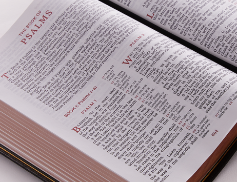
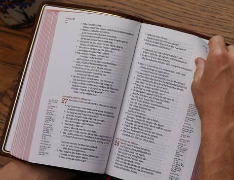
One thing you’ll notice when looking at Bibles is that some look different on the inside. There are various formats for designing a Bible. Each format, including the number of columns, paragraphing, and even cross-reference location, has its advantages. In this article, we’ll look at distinct Bible formats and see the advantages of each.
What are the popular Bible formats?
The layout affects the size of the Bible and how we use it. Some are better for reading while others are better for study, following along with a teacher, or for preaching. Here’s a look at the popular formats and what they’re best suited for.
Single-column
Single-column layouts provide one column of Bible text on a page in either paragraph or verse format (more on those formats later). They usually have 12-14 words a line and can look similar to a standard book.
Your eye doesn’t have to travel back to the top of the same page for reading. It’s a great choice for those who prefer to read in book style or wants to write notes in the wider margins.
Check out the NKJV, Single-Column Reference Bible as a great example of a single-column format Bible.
Double-column
Double-column layouts provide two columns of Bible text on a page. They’re printed in either paragraph or verse format. They usually have 8-10 words per line and look similar to a magazine or reference work.
Double-column layouts allow Bibles to be smaller even with the same size font as a single-column layout. This is important considering the Bible has almost 800,000 words. Double-column Bibles can be 10-25% smaller than single-column editions.
Your eye doesn’t need to travel as far across the page. This is especially more comfortable for those with transitional bifocals. It’s also a good choice for those who want the Bible to be as small as possible for its font size and tools.
Paragraph style
Instead of placing every verse on a new line, paragraph style keeps sentences and thoughts together. Paragraphs favor readability, while verse-by-verse layouts favor navigation. Paragraphs are found in both single and double-column layouts.
Single-column editions with paragraphs are more similar to a book. The extra word-count provides a wide enough column to produce beautiful poetry with a single unit of thought on one line. Letters, such as those in Ezra and Acts, can be indented without creating a column that’s too narrow. Bibles with this type of layout usually have more white space and are thicker than those with a double-column layout and the same font size.
Double-column editions don’t use as much white space. The poetic and letter formatting don’t leave as much blank space on the page. It’s still possible to format poetry, but the thoughts will be placed on multiple lines. Letters can still be indented. Both will look better with 10-12 words per line, which is possible with smaller fonts or moving the references to a new location.
One of the greatest advantages of paragraph style is improved readability. It keeps the Scriptures in context and shows where the subject changes.
While chapter and verse numbers are a great help in navigation, they were not part of the original text. They sometimes break up the text unnaturally and can become distracting. It can be a great benefit to read the Word of God without them.
Reader’s Bibles remove these breaks and distractions, including references, footnotes, and section headings to provide the biblical text in a layout that’s ideal for contextual reading. This removes the roadblocks and encourages deeper reading, reading more in a single session, and helping to see the overall narrative of a book. Reader’s Bibles encourage readers to actually read the Word of God in the style it was originally written.
What’s the best type of Bible for preaching?
Considering how important navigation is for preaching, verse-by-verse layouts are the most popular and easiest to use. They basically set the verses in a numbered list, which is ideal for giving a presentation and focusing on one verse. Verses are easy to find while scanning quickly.
Double-column layouts are also ideal for preaching and help you keep your place in public reading.
This is why Thomas Nelson offers the Preaching Bible in double-column, verse-by-verse format. It has wider columns than many editions because of its reference format, creating a text that looks impressive and is easy to read, navigate, and preach from.
Cross-reference formats
Cross-references can be placed in several locations on the page; each has benefits. Some include the footnotes with the references while others place them under the last verse or at the bottom of the page. Here are the most common reference formats and what they’re best suited for.
Center-column references
Center-column layouts have three columns on a page. The biblical text is placed in two wide columns with cross-references in a narrow column between them. The references are usually placed in verse order with the primary verse number printed in bold.
One of the most popular layouts places the cross-references for the left column at the top of the center column and the references for the right column at the bottom of the center column.
Outer-margin references
One of the best options for single-column layouts is to place the cross-references in the outer margin. This makes great use of the page design and can even provide some space for notes.
End-of-verse vs. end-of-page references
Two other popular options are to place the references at the end of the verses or at the bottom of the page.
End-of-verse references are in a smaller font at the end of the verse. The advantage of this is the references are right there where you need them; the disadvantage is there is limited space. They require verse-by-verse layouts and they can be a distraction.
End-of-page references are in a single column at the bottom of the page. There are several advantages to this design. There is no limit to the number of references that can be placed on a page. This layout moves the references away from the text to keep them from being a distraction for reading. This also allows text itself to have wider columns, allowing for more words per line or a larger font without readability suffering.
Conclusion
As we’ve seen here, there are lots of interior layout options for Bibles. Each layout has advantages and is well-suited to specific purposes and personal needs. Whether you need a single or double column; paragraph or verse; or something for carrying, reading, or preaching, you’ll find what you need in the Thomas Nelson Bible shop.


